
Warm Colors Interior Design
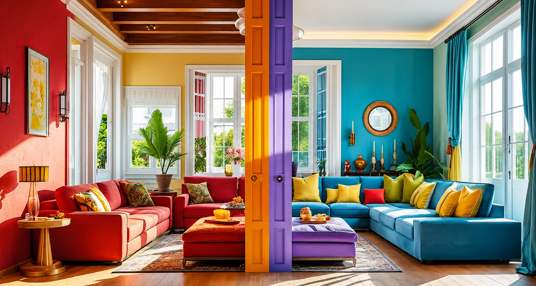
A well-designed space does more than look good; it feels comfortable the moment you step into it. This is where warm colors interior design play a key role. It brings depth, softness, and a sense of familiarity that transforms a house into a home.
Warm tones are often associated with comfort and connection. When used thoughtfully, they can make interiors feel more welcoming without overwhelming the space. Whether you prefer subtle neutrals or richer tones, understanding how to use warm colors effectively can elevate your entire home.
What Are Warm Colors in Interior Design
Warm colors typically include shades like red, orange, yellow, terracotta, and warm neutrals such as beige, cream, and soft browns. These tones are inspired by natural elements like sunlight, earth, and fire, which is why they feel inherently comforting.
In interior spaces, warm colors are often used to create an atmosphere that feels relaxed, intimate, and inviting. They can make large rooms feel cozier and smaller spaces feel more connected
Why Warm Colors Work So Well in Interiors
Warm tones have a unique ability to influence how a space is perceived. Unlike cooler shades, which can feel distant or minimal, warm colors bring a sense of closeness.
- They make spaces feel more welcoming
- They soften sharp architectural elements
- They add visual depth without complexity
- They create a sense of comfort and stability
When used correctly, warm colors can completely shift the mood of a room without requiring major design changes.
Understanding Warm Color Schemes in Interior Design
A well-balanced warm color scheme is not about using one shade everywhere. It’s about layering tones to create dimension.
| Color Category | Examples | Effect on Space |
|---|---|---|
| Soft Warm Neutrals | Beige, cream, warm white | Grounded and natural |
| Rich Warm Shades | Deep red, burnt orange | Bold and expressive |
Combining these thoughtfully helps create interiors that feel cohesive rather than flat.
Warm Neutral Interior Design: A Timeless Approach
Warm neutrals are one of the most versatile choices in modern interiors. They create a soft base that works across different styles.
- Warm beige adds subtle depth without overpowering
- Cream tones brighten spaces while maintaining softness
- Warm greys offer a balanced alternative to cooler palettes
A warm neutral interior design works especially well in living rooms and bedrooms where comfort is a priority.
Mixing Warm and Cool Colors in Interior Design
While warm tones are inviting, combining them with cooler shades can create balance. The key is not to let one overpower the other.
| Approach | Result |
|---|---|
| Warm base + cool accents | Balanced and modern |
| Equal mix | Dynamic and visually engaging |
| Warm dominant palette | Cozy and intimate |
For example, a warm beige room with muted blue accents can feel both grounded and fresh.
Warm Colors for Different Rooms
Living Room
The living room is where warmth truly shines. It’s a space meant for relaxation and connection.
- Use warm neutrals for walls
- Add terracotta or rust through cushions or rugs
- Incorporate wooden textures for added depth
Bedroom
Warm tones in bedrooms create a restful environment.
- Soft peach, beige, or warm white walls
- Layered textiles in warm tones
- Minimal contrast to maintain calmness
Kitchen
Warm colors can make kitchens feel more inviting and less clinical.
- Warm white cabinets
- Wooden finishes or brass accents
- Subtle earthy tones in backsplash or decor
Dining Area
Dining spaces benefit from slightly richer tones.
- Deep, warm shades encourage a cozy atmosphere
- Soft lighting enhances the warmth of the palette
Warm White Interior Design: Subtle Yet Effective
Warm white is often overlooked but plays a crucial role in creating balanced interiors.
Unlike stark white, warm white has undertones that soften the space. It works well in:
- Minimalist interiors
- Scandinavian-inspired homes
- Small spaces where brightness is needed without harshness
Warm Grey Interior Design: A Modern Twist
Warm grey is a refined choice for those who prefer understated elegance.
- It adds depth without making the space feel cold
- Works well with wooden textures and metallic accents
- Ideal for modern and contemporary homes
Warm Tones Decor: Adding Character Without Overdoing It
Decor elements are the easiest way to introduce warmth into a space.
- Cushions in earthy shades
- Rugs with warm undertones
- Curtains in soft neutral tones
- Artwork featuring warm palettes
These elements allow flexibility without permanent changes.
How to Use Warm Colors Without Overwhelming the Space
Using too many warm tones can make a space feel heavy. Balance is essential.
- Use lighter shades for walls and darker tones as accents
- Maintain contrast with textures rather than colors
- Avoid using multiple bold warm shades together
A layered approach ensures the design feels intentional.
Common Mistakes to Avoid
Even well-planned interiors can lose their appeal due to small missteps.
- Overusing dark warm tones in small spaces
- Ignoring natural light when selecting shades
- Mixing too many warm shades without balance
- Skipping neutral tones altogether
Being mindful of these helps maintain a polished look.
Creating a Cohesive Warm Color Interior
A cohesive space does not rely on a single color; it relies on consistency.
- Stick to a defined palette
- Repeat tones across different elements
- Use materials like wood, fabric, and metal to reinforce warmth
The goal is to create a space that feels connected rather than staged.
Why Warm Colors Continue to Be Popular
Warm interiors have a timeless appeal. They adapt easily to changing trends while maintaining comfort.
- They feel personal and lived-in
- They suit both traditional and modern homes
- They create a welcoming atmosphere for guests
This versatility makes warm colors a reliable choice for long-term design.